New Google maps display
Discussion


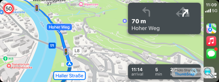
Apparently Google maps are trailling a new display/view on their google maps app.
It came up on my apple car play enabled car yesterday (and obviously my iphone. I thought it was a bit naff really, all you could really see was the blue line of your suggested route and mot a lot else.
I presume other people have encountered this downdate, what are your opinions?
It came up on my apple car play enabled car yesterday (and obviously my iphone. I thought it was a bit naff really, all you could really see was the blue line of your suggested route and mot a lot else.
I presume other people have encountered this downdate, what are your opinions?
andygo said:
Apparently Google maps are trailling a new display/view on their google maps app.
It came up on my apple car play enabled car yesterday (and obviously my iphone. I thought it was a bit naff really, all you could really see was the blue line of your suggested route and mot a lot else.
I presume other people have encountered this downdate, what are your opinions?
Why don't you use Apple Maps? I prefer the interface - have driven all over Europe using it.It came up on my apple car play enabled car yesterday (and obviously my iphone. I thought it was a bit naff really, all you could really see was the blue line of your suggested route and mot a lot else.
I presume other people have encountered this downdate, what are your opinions?
I've found it seems a little clearer?
Previously you could get to a junction with lots of turn offs and it was hard to decipher which was your actual route and which were alternate routes with the traffic info coloured in.
It does look like it's gone back in time aesthetically, but I also feel newer versions of Google maps has over-evolved... I don't care for things like "Latest in" news and reviews. I just want a map!
Suspicious_user said:
Why don't you use Apple Maps? I prefer the interface - have driven all over Europe using it.
I guess it's personal preference, I have always preffered Google ,aps rather than Apple for similar reasons I don't lean towards using Waze. I'm sure all 3 `are fine, but it's what you get familiar with. https://lifehacker.com/tech/how-to-change-new-goog...
Edited by andygo on Monday 20th November 10:26
Is this the new colour palette? Saw it a couple weeks ago. It popped up on one of my devices and then went away. Looked terrible from my 2 mins using it. Wasn't as distinct and obvious as the current version.
Been years since I used Waze, and it was alright from memory but Google was just infinitely more equipped with information. I guess that gap may have closed now?
I've use Apple Maps 3 times, and each time it took us a stupid way and we ended up changing back to Google Maps to get us on track. Oh we had one friend with a Windows phone/maps too, and that was also a disaster.
the-norseman said:
I use Waze as I prefer the warnings and also the speedlimit, I have speedlimits turned on, on Google maps but they very rarely show up.
I would have assumed that the speed limit of the road would have been displayed in the UK regardless of the app used? I know countries in Europe can be different (like France).That change has been around for a while. I mentioned this back in Sept:
https://www.pistonheads.com/gassing/topic.asp?h=0&...
And I still don't like it....
https://www.pistonheads.com/gassing/topic.asp?h=0&...
And I still don't like it....
Riley Blue said:
I've always preferred Google Maps interface, it's more like the paper maps I'm used to. There is one thing Waze does better, the spoken directions are said earlier so I'm not on top of a junction when I hear, "Turn Left." or whatever so, with reluctance, I tend to use Waze.
Does Google not tell you in advance? I don’t use it, but I’d have assumed it would have said in good time - turn left in 200m - APple maps on the motorway is either 2 miles or 2 km, depending on the units used. I can’t remember what it is in towns, but I’ve never had an issue with not knowing where to turn at a junction. Even oddities like this.
It looks like a green version of Waze with less features (no GPS speed, etc.).
I'm sure the 'old' Google was able to display in the centre instrument panel between the major dials as per the built in SatNav on my Cupra Formentor, but neither Waze nor the 'new' Google are able to do this.
I'm sure the 'old' Google was able to display in the centre instrument panel between the major dials as per the built in SatNav on my Cupra Formentor, but neither Waze nor the 'new' Google are able to do this.
I set out this morning and still had the old colour scheme. At some point mid-morning it had switched to the new colour palette. It's fine, I'd adjusted after a few minutes to be honest. More muted or toned down colours than previously, and probably not a million miles from the palette Apple Maps uses.
There's one issue I see, but I'll be in a minority here - railroads and level crossings, bridges etc
Previously railroads were thin black lines. But now they're very close to the grey that is used for roadways and with the lines being so thin you can't discern them from the background.
I've submitted feedback in the app highlighting the issue. I've reported map errors and issues before, and with time they usually get picked up and resolved.
Dunno if that'll happen with the colour palette, but I've done my part by reporting it, so fingers crossed something might change at some point in the future.
Suspicious_user said:
Does Google not tell you in advance? I don’t use it, but I’d have assumed it would have said in good time - turn left in 200m - APple maps on the motorway is either 2 miles or 2 km, depending on the units used. I can’t remember what it is in towns, but I’ve never had an issue with not knowing where to turn at a junction.
Spoken Google often isn't in good time, e.g. turn left in 200 yards when I'm right on the junction. It varies but is inconsistent so I use Waze.Suspicious_user said:
I’d be interested in how people are using it?
Phone in holder
Apple CarPlay
Android Auto
Does this have any vbearing on colours used - or if there’s a light/dark mode change?
Phone in holder for me. Which is what exasperates the railroads and level crossings colour camouflage. Those lines are too small on a phone screen to not be a different colour. They blend into the background, or blend into adjacent roadways and streets.Phone in holder
Apple CarPlay
Android Auto
Does this have any vbearing on colours used - or if there’s a light/dark mode change?
Gassing Station | Computers, Gadgets & Stuff | Top of Page | What's New | My Stuff