Discussion


I always struggle with creating excel charts either as I am stupid, or because I dont use them frequently enough - I prefer going with the latter option!
I have a list of properties in column A, in column B I have the date they last sold, in column c the price they they sold at, in column D the previous sale date, E the price etc up to column M
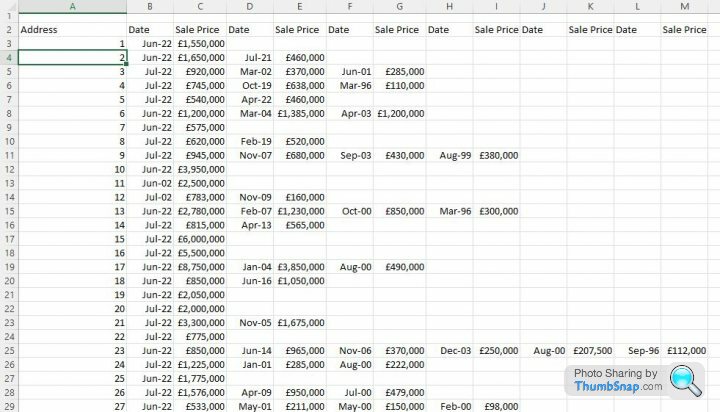
I want to create a chart which shows how each property has change in value over time. Is there an easy way of doing it? The above is one of two datasets, the other has about 4 times as many properties.
I have a list of properties in column A, in column B I have the date they last sold, in column c the price they they sold at, in column D the previous sale date, E the price etc up to column M
I want to create a chart which shows how each property has change in value over time. Is there an easy way of doing it? The above is one of two datasets, the other has about 4 times as many properties.
Whereas there will be ways to do it, as a fellow occasional excel user i'd probably change the layout a little and simply have the date running accross the header in row 2 (Jun, July, Aug etc). No need to write the title "sale price" in every other column.
Then just put the price in wherever it fits (for example, property 1 proce for jun would be cell b3, july cell c3, august cell d3 etc) and you'd more easily see the change, plus find it easier to create a line graph.
Then just put the price in wherever it fits (for example, property 1 proce for jun would be cell b3, july cell c3, august cell d3 etc) and you'd more easily see the change, plus find it easier to create a line graph.
Hmmm
Is there any software (preferably free or on Office 365) where I could manually create my chart? I could do it fairly easily on a piece of paper and if I am going to reformat my data (which I had a felling I might have to) drawing it by hand would probably be as easy! Especially as the other datasheet has 110 properties on it
Is there any software (preferably free or on Office 365) where I could manually create my chart? I could do it fairly easily on a piece of paper and if I am going to reformat my data (which I had a felling I might have to) drawing it by hand would probably be as easy! Especially as the other datasheet has 110 properties on it
Thinking about this more I am going to return to it later! The graph would be nice to have I think but could look messy due to the amount of data.
Its all for a talk and I need a draft of the talk by Monday. I need to do other work on the data averaging it between council tax bands etc which I can do! So I'll do all that, draft the talk ready for Monday then during next week I'll consider whether I need this graph and whether I can actually create it!
Thanks for the input so far
The issue you have is the amount of data and its granularity.
If it were average per year (instead of 2 sales in a specific year) you could use this:
https://superuser.com/questions/546303/how-to-tabulate-data-of-street-house-price-history-for-graphing-in-excel


If it were average per year (instead of 2 sales in a specific year) you could use this:
https://superuser.com/questions/546303/how-to-tabulate-data-of-street-house-price-history-for-graphing-in-excel
Du1point8 said:
The issue you have is the amount of data and its granularity.
If it were average per year (instead of 2 sales in a specific year) you could use this:
https://superuser.com/questions/546303/how-to-tabulate-data-of-street-house-price-history-for-graphing-in-excel
Thanks. Yes having spent hours looking up the historic sales data I am not sure it helps my presentation as ther eis too much of it!If it were average per year (instead of 2 sales in a specific year) you could use this:
https://superuser.com/questions/546303/how-to-tabulate-data-of-street-house-price-history-for-graphing-in-excel
I am arguing about a Council Tax revaluation so now working on what band the property is in, how many in that ban sold and creating dougnut charts as they look pretty!
Gassing Station | Computers, Gadgets & Stuff | Top of Page | What's New | My Stuff