Setting up an eLearning business - advice sought
Discussion
Looking for advice from web programmers, especially anyone with eLearning knowledge, regarding a business I'm in the planning stages of.
I've written a technical requirements document and a business plan. Looking at costings to get to a minimum viable product, but also keen to hear from anyone with advice around angel investment. I have some money I am going to invest in it, but it's always nice to have options.
(I've got 12 years of experience in education, 7 of which is in management and the specific area I'm looking at.)
Thanks in advance for any help and advice.
happy to have a look - details in profile...
too little information in your post - eLearning can cover so many things, and there are options to use fairly standard software, or other scenarios which might mean you need fully bespoke code... Bespoke code can cost from low £thousands to systems costing hundreds of thousands!
too little information in your post - eLearning can cover so many things, and there are options to use fairly standard software, or other scenarios which might mean you need fully bespoke code... Bespoke code can cost from low £thousands to systems costing hundreds of thousands!
I'm currently launching an online course and after loads of research I've gone with a platform called teachable.
I can imagine it's too basic for some but it's been great for my needs, comes with a website you can customize yourself as well.
I'd say the best thing about it though is all the help they provide through blog posts and videos, even if you dont go with it they have great info on how to promote a course etc. Which is worth a read.
Hi
some quick thoughts to consider, some of the below might not be relevant depending on your plan or may already have this covered but just in case!
Good luck with the venture either way
Andy
some quick thoughts to consider, some of the below might not be relevant depending on your plan or may already have this covered but just in case!
- get your strategy set from the off - how are you going to price it - one off/subscription?, do you expect regular repeat visits or one off attendance, how will people consume the content - mobile/desktop, how much time will end users spend working through content - how often will you release new content, is it UK based or global (multiple languages?) how will you market it/how will people find out about it? do you want content recognised/endorsed/co-created with any official body/organisation etc. how are your target audience currently learning, what are the benefits and barriers to them using your content, who would be your competitors (if any) what do they currently do?
- is it pure e-learning or is it blended e.g. classroom/webinars/pre-read etc too
- what do you want to track/report - attendance/completion/scores/pass/fail/certification etc - do you want full online automated payment/sign up/course registration or will it be a combo of offline/online - to do it properly you will need the content on a learning management system (LMS) there are various free and paid for solutions for this
- consider working with an instructional/learning designer - they can help take a subject you know inside out and turn it into content that works from an end user point of view - people often skip this step and the content just doesn't work as well as it should - either cramming in too many learning objectives into one piece of content, questions not making sense/to easy/too hard, scenarios being contrived, level of content not pitched correctly to audience type etc
- off the shelf vs custom content creation - for off the shelf Articulate, captivate and Gomo are worth having a look at - there are companies (UK and offshore) and freelance developers who specialise in these apps - creating custom SCORM content (LMS compatible content) is also possible but costs can add up quickly - the ideal is to plan some template types before starting developing content so you write the content to fit the templates as much as possible, limiting custom development tasks will keep the costs down.
- make sure you get the look and feel/branding and tonality of content sorted from the start
Good luck with the venture either way
Andy
Hi everyone,
After 2 years of planning and nearly a year of development and a ridiculous amount of money developing the backend, I have the beginnings of a business.
www.myvideotutor.com
Put simply, we are an online platform where any teacher or tutor can upload video lessons, focused initially around GCSE, with work that synchronises to the video. Plus, students can have their work marked by the lesson creator too!
The price per lesson is teacher-defined and they earn the majority of what users pay for their content (typically £3-6). With a typical private tutoring lesson costing £35-50 an hour (or more in some areas of the country) then we are aiming to deliver 70% of a private lesson experience for 10-15% of the costs.
We are currently in a soft-launch state and have almost 200 lessons on the platform, but this is growing daily.
If anyone has a GCSE student in their family and wants to try it out at a massive discount I can create vouchers on the system for them to try it all out - happy to sort this. Also, we are working with an online marketing company to get the awareness of the product out there over the next few weeks on Google/SEO, but if anyone has innovative ideas about reaching our directly to PARENTS (preferably in an offline way, but also online too) and has marketing experience of that then I'd be very interested to hear from you.
Looks very good, and obviously a lot of hard work has gone into the project.
I’m not your target audience as my kids are all through education now, but just a few things I noticed-
The registration button for your new customers is a bad link, just goes to ‘unknown 404’.
Prices? Just couldn’t get a handle on how much the fees were? Maybe you have to register? For me, unless I see clear transparent pricing upfront and easy to find I move on fairly quickly.
Example videos? Again, couldn’t find any clips or examples of what you would get when purchasing a lesson. A quick montage of a variety of the lessons would push me in the right direction if done well.
Anyway, well done. Hope it goes well for you after all the hard work.
Thanks for your comments!
I just checked on the registration and it seems to be working fine? Hopefully just a momentary issue. The reg page is: https://app.myvideotutor.com/auth/register/
Yeah, we are working on updates to the main splash page at the moment. The site once registered looks very different. Here's a view of a sample lesson:
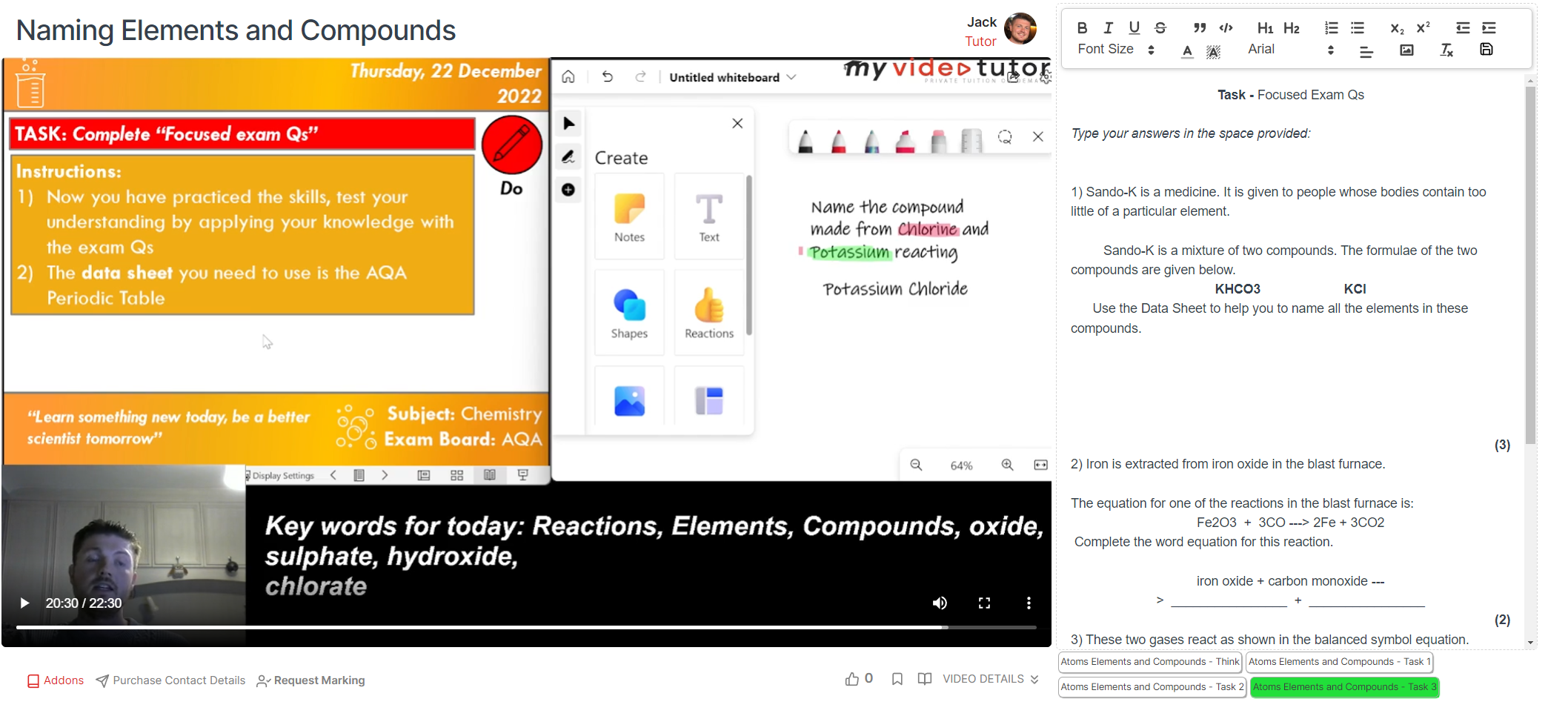
The work can be submitted online or they can use a QR code to take pictures of their physical notebook if they prefer if they want to purchase marking.
Pricing-wise, everything is different, but you're right in that it probably needs to be in your face more quickly. And the montage thing/quick video of lessons is something I've already requested from the tech team, but you're definitely right there!
I just checked on the registration and it seems to be working fine? Hopefully just a momentary issue. The reg page is: https://app.myvideotutor.com/auth/register/
Yeah, we are working on updates to the main splash page at the moment. The site once registered looks very different. Here's a view of a sample lesson:

The work can be submitted online or they can use a QR code to take pictures of their physical notebook if they prefer if they want to purchase marking.
Pricing-wise, everything is different, but you're right in that it probably needs to be in your face more quickly. And the montage thing/quick video of lessons is something I've already requested from the tech team, but you're definitely right there!

Excellent. Sounds like your on top of the development.
Just checked on the registration, and still not working for me. I’m following the burger menu to the big registration button. Piccies attached of the result. Using iPhone 13pro and no VPN or blockers.
Hopefully others on here can check for you aswell.
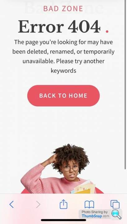
Just checked on the registration, and still not working for me. I’m following the burger menu to the big registration button. Piccies attached of the result. Using iPhone 13pro and no VPN or blockers.
Hopefully others on here can check for you aswell.


the mobile view (can also be seen by minimising a desktop browser window) is going to an old URL:
https://elementor.deverust.com/synauw/template-kit...
whereas the main menu goes correctly to the register page...
I would also look at why the spinner continues to run on that page...
https://elementor.deverust.com/synauw/template-kit...
whereas the main menu goes correctly to the register page...
I would also look at why the spinner continues to run on that page...
Some useful comments already, about what is clearly a very good place you’ve got to already, I’d just add a few.
Customer journey: having to register before you can get a handle on pricing, sample content, etc is likely to be a big problem for you when it comes to abandonment. Not sure if it’s a deliberate attempt to farm contact details, increase registration numbers etc, early on but I’d suggest rethinking where you put this in your customer journey.
Links: you’ve got a couple in the grey box (subjects / topics) on the home page that don’t go to where/do what a user will probably expect. This could be deliberate in order to prioritise development work but, if not, might be worth looking at.
Digital marketing: ties in somewhat to customer journey. Depending on what you’ve commissioned you’ll get some mixture of traffic, statistics, and insight. Of these, in isolation, traffic is the least important to you right now. The most valuable reporting you can get is going to relate to how users interact with your site (which pages they visit, how long they stay, and whether they proceed to and through your registration process). From this you can get much more insight about how you think users perceive what you’re offering.
Return visitors/customer capture: I suspect that with this sort of product, repeat visitor numbers will be low if first time visitors don’t immediately see sufficient value or relevance. If I’m right, you won’t get many chances to convert a user landing on the site. One of the most important things you could be doing right now (before your digital campaign) is adding a low-effort way for users to tell you what they were looking for (in terms of course content) and sign up for future information, allowing you to cheaply and proactively reach out to them when such materials are available whilst also giving you valuable insight into what visitors are looking for (in order that you can focus development/creator outreach accordingly).
There are so many ways you could develop this from where you are today, I reckon it could be an interesting journey for you!
Congratulations on the startup, looks like a lot of thought has gone into the site and e-learning is a tricky area to pull off. 
I've put together some thoughts as someone who is interested in design and usability. Some maybe helpful. I've only looked at the home page, but some of these things will apply across site.
First impressions
There’s a lot going on and everything seems to be competing for my attention and I’m not sure what action you want me to take.
There’s a lot of red.
The navigation bar is showing the mobile burger icon and works while viewing on a desktop computer. Only show this on mobile (and tablet view if the nav won’t fit).
Hero section
I’m classing the hero section as the portion below the main navigation, down to (but not including) the grey second navigation bar (Videos, Subjects etc).
The wording on the left-hand side sounds good, but I would suggest a couple of changes.
Lose the red blob behind the image or at least make it less in your face by reducing the opacity.
Lose the red shadow behind the screenshot completely. Sorry, nothing good to say about that bit - it’s grim and looks amateurish.
Secondary navigation
The Videos, Subjects, Topics, Tutors navigation under the hero section seems a bit out of place and maybe unnecessary. It also seems to be squished right up to the hero section above it.
Could this be incorporated into the main navigation seeing as a couple of the options are already there?
Fonts and colours
There doesn’t seem to be consistency here. Some buttons have massive text on them, some smaller text. Try and keep these consistent across the site. Same with all the typography.
I would stick to using red for the headlines and make any body copy near black/dark grey. As you scroll down the page, much of the body copy is either full on red or a shade of red and neither pass accessibility requirements for people with visual impairments.
There seems to be 5 different fonts on the page:
SEO
I’m not an SEO expert at all, but in addition to the headline hierarchy (h1-h6) as mentioned a bit further up, I think there is some scope for improvement in the page title(s). There also doesn’t appear to be a meta description (at least on the home page).
Performance
Some of the file sizes for the images are quite large and there could be some good savings to make with those.
Run the images through https://tinypng.com/ to reduce the page load size.
I hope some of that ramble was useful. Best of luck with the business!

I've put together some thoughts as someone who is interested in design and usability. Some maybe helpful. I've only looked at the home page, but some of these things will apply across site.
First impressions
There’s a lot going on and everything seems to be competing for my attention and I’m not sure what action you want me to take.
There’s a lot of red.
The navigation bar is showing the mobile burger icon and works while viewing on a desktop computer. Only show this on mobile (and tablet view if the nav won’t fit).
Hero section
I’m classing the hero section as the portion below the main navigation, down to (but not including) the grey second navigation bar (Videos, Subjects etc).
The wording on the left-hand side sounds good, but I would suggest a couple of changes.
- The heading “Quality private tuition on demand” is an h2. This needs to be an h1. There is no h1 heading on the page currently. This is important from a search engine optimisation point of view.
- The h1 also needs to be a different size ideally from the other headings on the page. Currently, it’s the same size as all the other major headings. Either increase the size of the hero heading or reduce the size of the others.
- The tagline text underneath is bold text. You could probably lose the bold text and make it ‘slightly’ bigger (although not massive – think 18 – 20px tops)
- Add a call-to-action button underneath the tagline with some carefully considered wording depending on what you want the users’ primary action to be (Register might be a bit too generic)
Lose the red blob behind the image or at least make it less in your face by reducing the opacity.
Lose the red shadow behind the screenshot completely. Sorry, nothing good to say about that bit - it’s grim and looks amateurish.
Secondary navigation
The Videos, Subjects, Topics, Tutors navigation under the hero section seems a bit out of place and maybe unnecessary. It also seems to be squished right up to the hero section above it.
Could this be incorporated into the main navigation seeing as a couple of the options are already there?
Fonts and colours
There doesn’t seem to be consistency here. Some buttons have massive text on them, some smaller text. Try and keep these consistent across the site. Same with all the typography.
I would stick to using red for the headlines and make any body copy near black/dark grey. As you scroll down the page, much of the body copy is either full on red or a shade of red and neither pass accessibility requirements for people with visual impairments.
There seems to be 5 different fonts on the page:
- Aleo
- Libre Baskerville
- Source Sans Pro
- Altone
- Altone variable
SEO
I’m not an SEO expert at all, but in addition to the headline hierarchy (h1-h6) as mentioned a bit further up, I think there is some scope for improvement in the page title(s). There also doesn’t appear to be a meta description (at least on the home page).
Performance
Some of the file sizes for the images are quite large and there could be some good savings to make with those.
Run the images through https://tinypng.com/ to reduce the page load size.
I hope some of that ramble was useful. Best of luck with the business!

Edited by P4ulB on Thursday 23 February 10:45
Really appreciate the time both of you have spent on that. Thank you. I'd buy you a drink in person, but since that will likely prove difficult consider all of you having helped as entered free into the PH lotto for next Friday. Details here: https://www.pistonheads.com/gassing/topic.asp?h=0&...
P4ulB
LooneyTunes
Ham_and_Jam
akirk
Andy Ted
Cheers!
We are currently working on:
- SEO/marketing with an agency
- definitely putting into place the comments regarding the front-end design. Agreed on all. The behind the scenes looks better (see pics below)
- making the 'behind the scenes' look of the site visible to people within 2 seconds of landing
- higher promotion of the core USPs of the site (quality instruction, integrated work, optional marking)
- streamline of navigation
- performance (we know that this needs to be better for initial mobile browsing, with that driving 80% of casual visits)
- some offline marketing (leaflets, cards - but definitely need help in this area from an expert)
- building more content (almost 200 lessons, but need a lot more)
Going to make this work if it kills me!
spud___ said:
Really appreciate the time both of you have spent on that. Thank you. I'd buy you a drink in person, but since that will likely prove difficult consider all of you having helped as entered free into the PH lotto for next Friday. Details here: https://www.pistonheads.com/gassing/topic.asp?h=0&...
P4ulB
LooneyTunes
Ham_and_Jam
akirk
Andy Ted
Cheers!
We are currently working on:
- SEO/marketing with an agency
- definitely putting into place the comments regarding the front-end design. Agreed on all. The behind the scenes looks better (see pics below)
- making the 'behind the scenes' look of the site visible to people within 2 seconds of landing
- higher promotion of the core USPs of the site (quality instruction, integrated work, optional marking)
- streamline of navigation
- performance (we know that this needs to be better for initial mobile browsing, with that driving 80% of casual visits)
- some offline marketing (leaflets, cards - but definitely need help in this area from an expert)
- building more content (almost 200 lessons, but need a lot more)
Going to make this work if it kills me!
Thank you for the PH lotto entry - didn't even know that was a thing!P4ulB
LooneyTunes
Ham_and_Jam
akirk
Andy Ted
Cheers!
We are currently working on:
- SEO/marketing with an agency
- definitely putting into place the comments regarding the front-end design. Agreed on all. The behind the scenes looks better (see pics below)
- making the 'behind the scenes' look of the site visible to people within 2 seconds of landing
- higher promotion of the core USPs of the site (quality instruction, integrated work, optional marking)
- streamline of navigation
- performance (we know that this needs to be better for initial mobile browsing, with that driving 80% of casual visits)
- some offline marketing (leaflets, cards - but definitely need help in this area from an expert)
- building more content (almost 200 lessons, but need a lot more)
Going to make this work if it kills me!
Glad it was useful - thought it might have been a bit harsh initially.
Couple of extra things.
- Use the colour sparingly - red can be a bit harsh on the eyes
- Consider white space to give everything room to breath (hate that phrase!)
- Colour isn't the only way to bring attention to things
- Rows and columns are your friend in design
Edited by P4ulB on Thursday 23 February 14:07
Note: if anyone has experience in marketing this kind of new niche (we don't have a single direct competitor, only companies which offer different aspects of elearning), in the offline arena, please get in touch.
We want to reach:
- lower/middle income parents who are aspirational
- cannot afford traditional private tutoring
- communities who serve the above
- disadvantaged groups within areas/schools/Trusts/LEAs who want to offer our facilities at
Budget negotiable depending on what you offer, but we are willing to pay well for high-performing results which will complement our existing online marketing and SEO work which we are just beginning.
spud___ said:
Really appreciate the time both of you have spent on that. Thank you. I'd buy you a drink in person, but since that will likely prove difficult consider all of you having helped as entered free into the PH lotto for next Friday. Details here: https://www.pistonheads.com/gassing/topic.asp?h=0&...
That’s very kind, and unexpected, Spud. Thank you. I’ve got a few other thoughts that might be of interest, do you mind if I PM you?
2 questions from me:
1. Is it uk only ? I have an English pal in Italy teaching English as a foreign language. Could he use it for his Italian students?
2. What extra benefits are you offering to creators who sign up at this soft launch stage? You need new content quickly! Im thinking creator gets 100% of their fees for 1st 6months or something.
Gassing Station | Business | Top of Page | What's New | My Stuff


