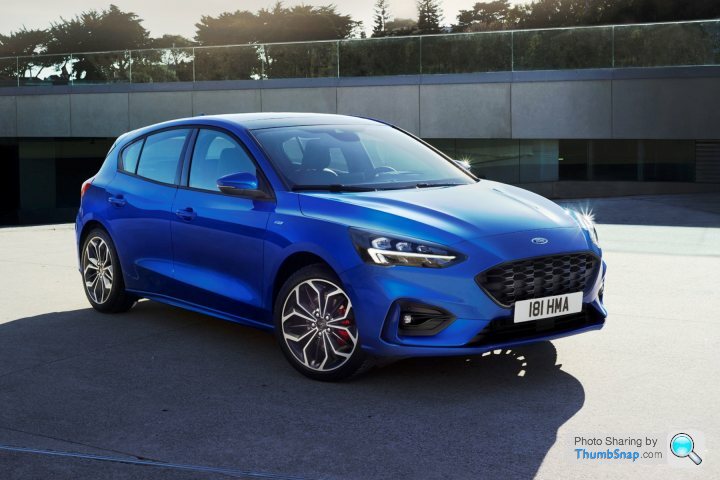
New focus revealed
Discussion
Looks... interesting on the outside. Inside looks decent enough
Hope it retains the fun to drive factor though.
https://www.youtube.com/watch?v=t-kZ9yv-tho
Hope it retains the fun to drive factor though.
https://www.youtube.com/watch?v=t-kZ9yv-tho
Much better than the last one and, even with rear lights I seriously dislike on the Fiesta, still better than the old rear lights.
Can't take the dash seriously though as it looks like the robot on the Cadbury's Smash advert.
Not a bad evolution, a bit Volvo-ish but still too bland for my taste.
The Mégane is far more visually daring.
Can't take the dash seriously though as it looks like the robot on the Cadbury's Smash advert.
Not a bad evolution, a bit Volvo-ish but still too bland for my taste.
The Mégane is far more visually daring.
Edited by LuS1fer on Wednesday 11th April 10:13
Why does the screen have to be coming out of the dash like that.
Don't understand why they don't integrate it more, Totally puts me off when I see a car that has one like that.
It just looks like they have done all the design work and then thought woops we forgot to add the touchscreen, I know lets just tack it on by here. No one will mind.
Don't understand why they don't integrate it more, Totally puts me off when I see a car that has one like that.
It just looks like they have done all the design work and then thought woops we forgot to add the touchscreen, I know lets just tack it on by here. No one will mind.
fewfe3 said:
Why does the screen have to be coming out of the dash like that.
Don't understand why they don't integrate it more, Totally puts me off when I see a car that has one like that.
It just looks like they have done all the design work and then thought woops we forgot to add the touchscreen, I know lets just tack it on by here. No one will mind.
Doesn't look quite as bad or half arsed as the ipad on a stick that Mercedes used but it's still pretty poorly integrated. Don't understand why they don't integrate it more, Totally puts me off when I see a car that has one like that.
It just looks like they have done all the design work and then thought woops we forgot to add the touchscreen, I know lets just tack it on by here. No one will mind.
GTEYE said:

To be honest, I think that looks quite good, certainly a step forwards on the current car.
Why no story on PH?
I'd expect a story on PH when more details of the ST version are revealed. At the moment there's not really any proper performance model so nothing really "PH-worthy"

V6Alfisti said:
Not a looker is it, the blue version above looks ok but the moving pictures make it look staggeringly ugly. It reminds me of the facelift Scorpio for it's level of 
Yes, I've let it "mature in my mind" and have gone back for a second look and it now looks really bland with a silly smiley face. In fact, the rear reminds me of an Astra and that can't be good.
I saw a Corsa, Crossland and Grandland on display in a shopping centre today and nearly fell asleep just glancing at them.
I didn't realise the blue one was an ST-Line - which doesn't inspire me with any hope for the eventual real ST and the Vignale ...well, just doesn't look like a quality item with that silver plastic stuck all over it.
Again, that stuck on TV is a fad I won't be embracing.
I'm afraid that probably aces Ford out of any future car choice, for me.
Gassing Station | Motoring News | Top of Page | What's New | My Stuff


 king gash.


