Discussion


Surely if any car has a claim to the great man's legacy it would be the new NSX?
Senna had very little to do with the McLaren F1 project and Jonathan Palmer did most of the work as by that point Senna was on the outs with the team (race by race contract in 1993).
In fact the only thing I can recall was him being present at the Monaco launch (with the early high wing mirror prototype).
I thought that everything to do with Senna was controlled by his foundation especially his signature. Unless the buyer paid a bit of money to the foundation. Anyway, agree with others that it's a bit tacky. No real association with Mclaren road car development and was driving for Williams already I think
lauda said:
flemke said:


I usually try to avoid criticising what someone has done to his/her pride-and-joy. Without criticising the "Senna" version, let's say that the "Prost" version works much better, as in much better. That was my point in posting: same idea, different outcome.
Fwiw, I would say that in the flesh the "Senna" version looks no better than it does in images, but the "Prost" version def does look better. The way the blue works against and contrasts with the white is good - much like it was on the original helmet.
flemke said:
lauda said:
flemke said:
I usually try to avoid criticising what someone has done to his/her pride-and-joy. Without criticising the "Senna" version, let's say that the "Prost" version works much better, as in much better. That was my point in posting: same idea, different outcome.
Fwiw, I would say that in the flesh the "Senna" version looks no better than it does in images, but the "Prost" version def does look better. The way the blue works against and contrasts with the white is good - much like it was on the original helmet.
gunner said:
Agreed...the Prost car is really very beautiful in the flesh.
Flemke,as an F1 owner and Mclaren officianado can I please ask what do you think of the P1?
Things I don't like about the car are, mainly, the extra weight owing to the electric gimmicks, the width, and the complexity of operation/controls. There are a few other niggles, but that is the gist.Flemke,as an F1 owner and Mclaren officianado can I please ask what do you think of the P1?
Things I do like are braking power and feel, precision (although not returnability) of steering, lateral grip, acceleration, chassis balance and predictability, and looks. Driver ergonomics are exceptional: it's so comfy in there that you don't want to leave even if you're parked. Ride is good, although not as extraordinary as some seem to think.
Build quality fine, but not as good as Veyron and prob not quite as good as 918, although much better than LaF.
Overall it is a fantastic machine, although, like most "supercars", its range of applications is frustratingly narrow.
Streetrod said:
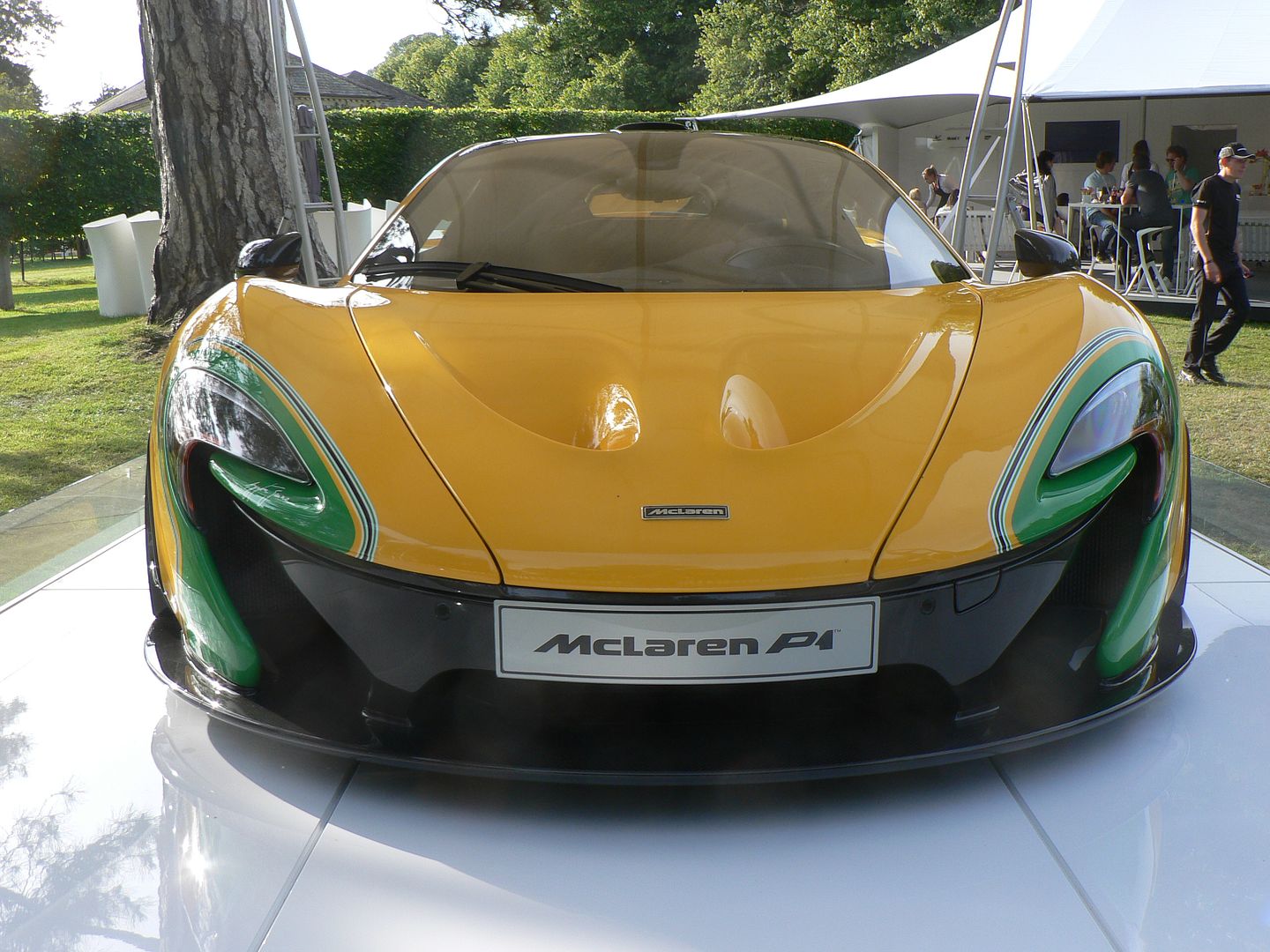
This has to be one of the best looking P1's so far. Here are a couple of pics I took at the FOS today, these do not do the car justice:
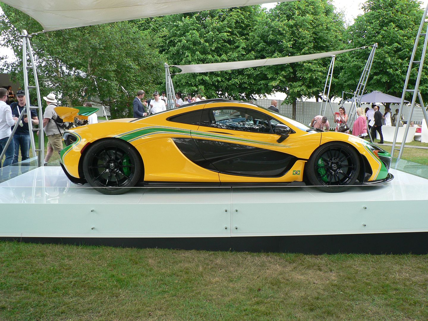
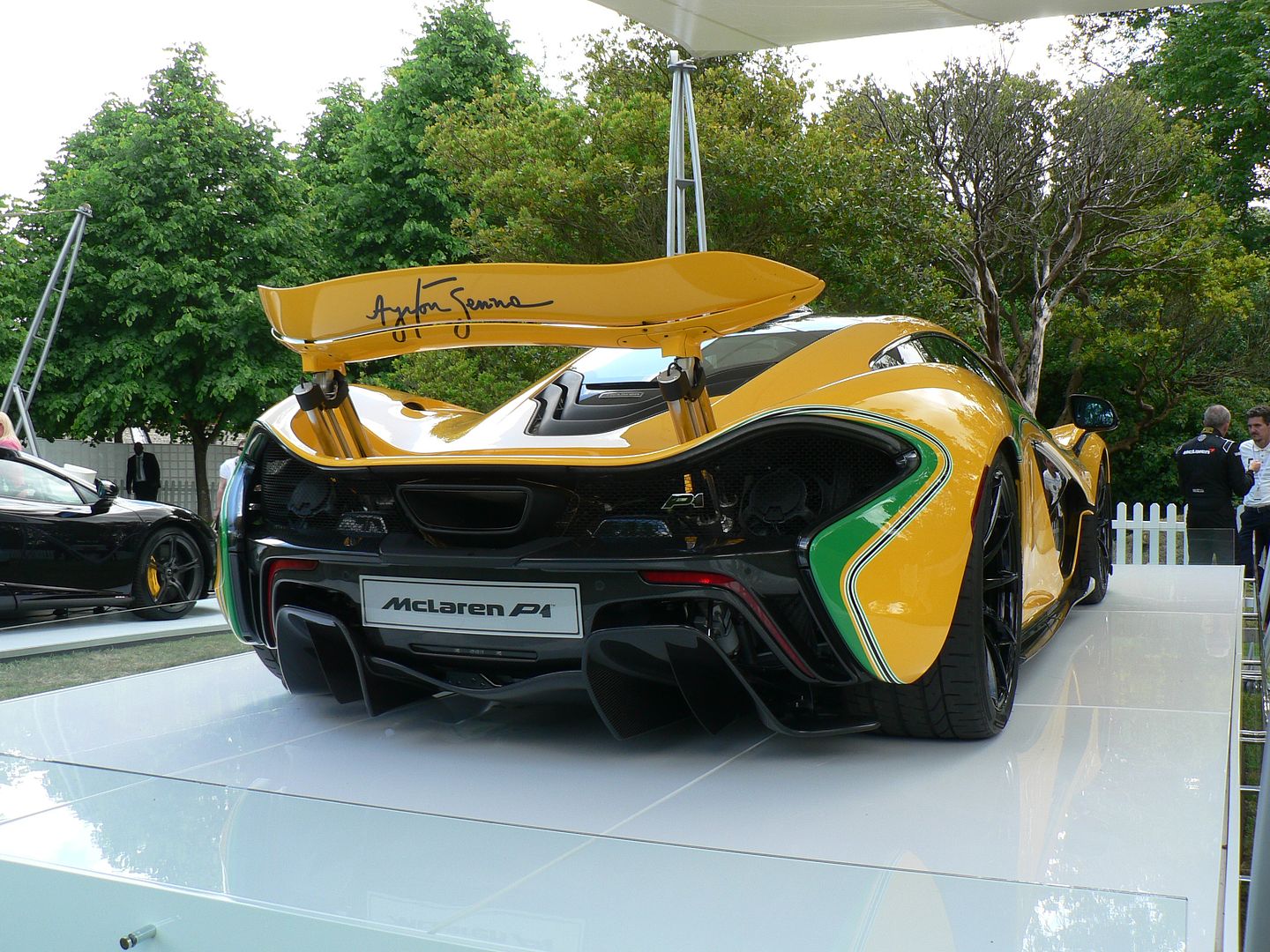
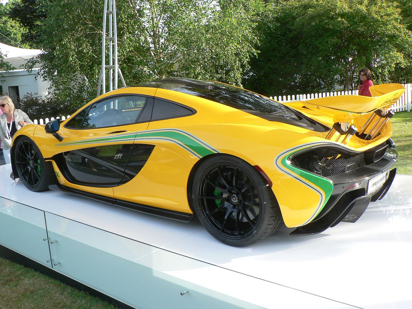
This is how that colour scheme should be done:


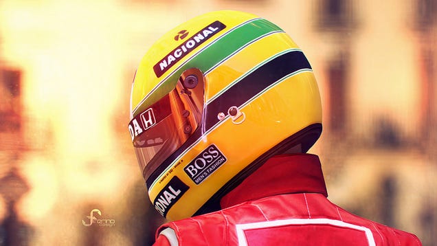

The reason that the helmet design works is that, although the majority of surface is yellow, the areas of green and blue are large, simple in shape, and equal in size. Unfortunately, none of those adjectives can be applied to the car. Indeed, from any distance there appears to be no blue at all. An aggravating factor is that the curves of the stripes are discontinuous.
I'm not saying that the shape of the P1 lends itself to the geometric layout of the wide stripes on the helmet, but, to make that scheme work on the car, the situation called for something much closer to the feel of the helmet. Alternatively, it might have worked with something totally different from the helmet. Either way, the design needs more green, and a lot more blue.
The main reason, I would suggest, that in real life the car paint "pops out" is because McLaren used a clean yellow with a lot of pearl (IIRC) in it. In itself, that's great, and the green stripes help to provide contrast and lift the yellow further.
One just wishes that they had gone for something other than a few tentative stripes around the edges.
If, for example, they had done the big green-yellow-blue bands across the side of the car, or possibly in the large aero recess of the side, that would have been more cohesive, more consistent with the helmet, and overall prob better looking.
Gassing Station | McLaren | Top of Page | What's New | My Stuff