The second coming of Jaguar begins
Jaguar says it wants to champion true originality. It starts with reimagined branding...

Talking to journalists at length about brand values is always perilous, especially if you intend on untethering the experience from an actual car. It’s like talking to small children about sweets: you can use words like ‘exuberant’ and ‘compelling’ all you like, but the proof is very much in the rhubarb custard. Show, don’t tell. That’s the rule.
But Jaguar’s wholesale, no-one-left-behind approach to its new electric era is so unprecedented that, in the build-up to revealing its Design Vision Concept next month, it felt like it needed to have a grown-up chat about the electrified path it has opted to walk down. Predictably, this did include big words (or words in a big font at any rate, ‘fearless’ among them) but it also meant unveiling the practical hallmarks of its new identity - or four ‘key symbols of change’, as Jaguar termed them.
We’ll come to them in a minute, but first the big idea stuff. JLR is very fond of a quote it attributes to Sir William Lyons: ‘A Jaguar should be a copy of nothing’. That, it reckons, is at the cornerstone of its new vision. Stylistically, that might be true (or vaguely true) but strategically speaking, Jaguar is very much attempting to copy Land Rover’s success in a) landing the Range Rover in an exalted, upmarket niche very nearly all of its own, and b) relaunching the Defender to widespread critical acclaim and towering sales figures.

This makes sense. One is highly regarded enough to easily command six-figure asking prices and sustain a hived-off brand all of its own; the other pioneered a daring new look that, while derivative in some respects, instantly defined its place in the world. Clearly, Range Rover took multiple generations to arrive at its current position in the market, but the Defender (underpinned by a reputation of similar historical depth to Jaguar) managed to pull it off in one bold, epoch-altering move. The manufacturer’s taste for ‘Exuberant Modernism’ as it calls its new creative philosophy, is transparently a lesson learned in that moment.
Or, as Gerry McGovern, JLR’s Chief Creative Officer, put it: “This is a reimagining that recaptures the essence of Jaguar, returning it to the values that once made it so loved, but making it relevant for a contemporary audience. We are creating Jaguar for the future, restoring its status as a brand that enriches the lives of our clients and the Jaguar community.”
The firm is no less forthright about the fact that its targeted audience is about to get significantly smaller. It expects to double the current average price of a Jaguar (around £55k) as the brand - and the lower volume product it sells - become more aspirational. This means changes to the dealer footprint, its digital ecosystem, customer servicing and the way Jaguar interacts with its owners. There are obviously many facets to this seismic shift, although when Rawdon Glover talked about ‘reframing the relationship on the customers' terms’, it probably spoke to the core of what the firm will try to achieve over time.

Without going into detail about its future three-car lineup - beyond confirming the nature of its initial four-door GT - Jaguar reiterated that its transition to battery-electric technology is non-negotiable; there will be no return to combustion under any circumstances. It justified this decision in three ways: firstly, that its comparatively late arrival to the EV market will likely play to its advantage (i.e. the worm will eventually be made to turn by legislation); secondly, that its next-generation tech, projected to offer up to 430 miles in range, will be sufficiently ‘game-changing’ for buyers to engage with it organically; and thirdly, by dint of its ‘dramatic new visual language’, it will produce cars that illicit a ‘visceral reaction’ in its global audience. In other words, if Jaguar is doing its job properly, it expects ‘people to feel more than they think’. They will buy on impulse.
To call this ambitious rather undersells the scale of the challenge. Jaguar’s current reputation, while sporadically bolstered by some very nice-to-drive cars, has mostly atrophied in terms of raw desirability. McGovern suggested that the brand’s ‘previous strategy did not allow Jaguar to be unique’, which succinctly describes at least three decades of volume-chasing, German-rivalling, mostly identikit cars. The decision to fundamentally break with this ailing tactic has always seemed prudent; whether or not Jaguar can actually resuscitate its image (and bottom line) primarily by applying ‘bold designs, unexpected and original thinking’ to the already saturated world of high-end EVs, is a notion that will hang in the balance for years to come.
But the process, at any rate, starts here. While the primary ‘physical manifestation’ of Exuberant Modernism will remain under wraps until Miami Art Week (a public installation that we’re told involves gallery spaces spread over two locations), Jaguar has opted to lay the groundwork for its wider brand overhaul with some of the finer details. Truthfully, these fluctuated dramatically in terms of real-world importance - one of them is ‘Exuberant Colours’, a pledge to use primary colours as ‘tonal building blocks’ - so let’s skip that and consider the remaining three in ascending order of likely impact on buyer consciousness.

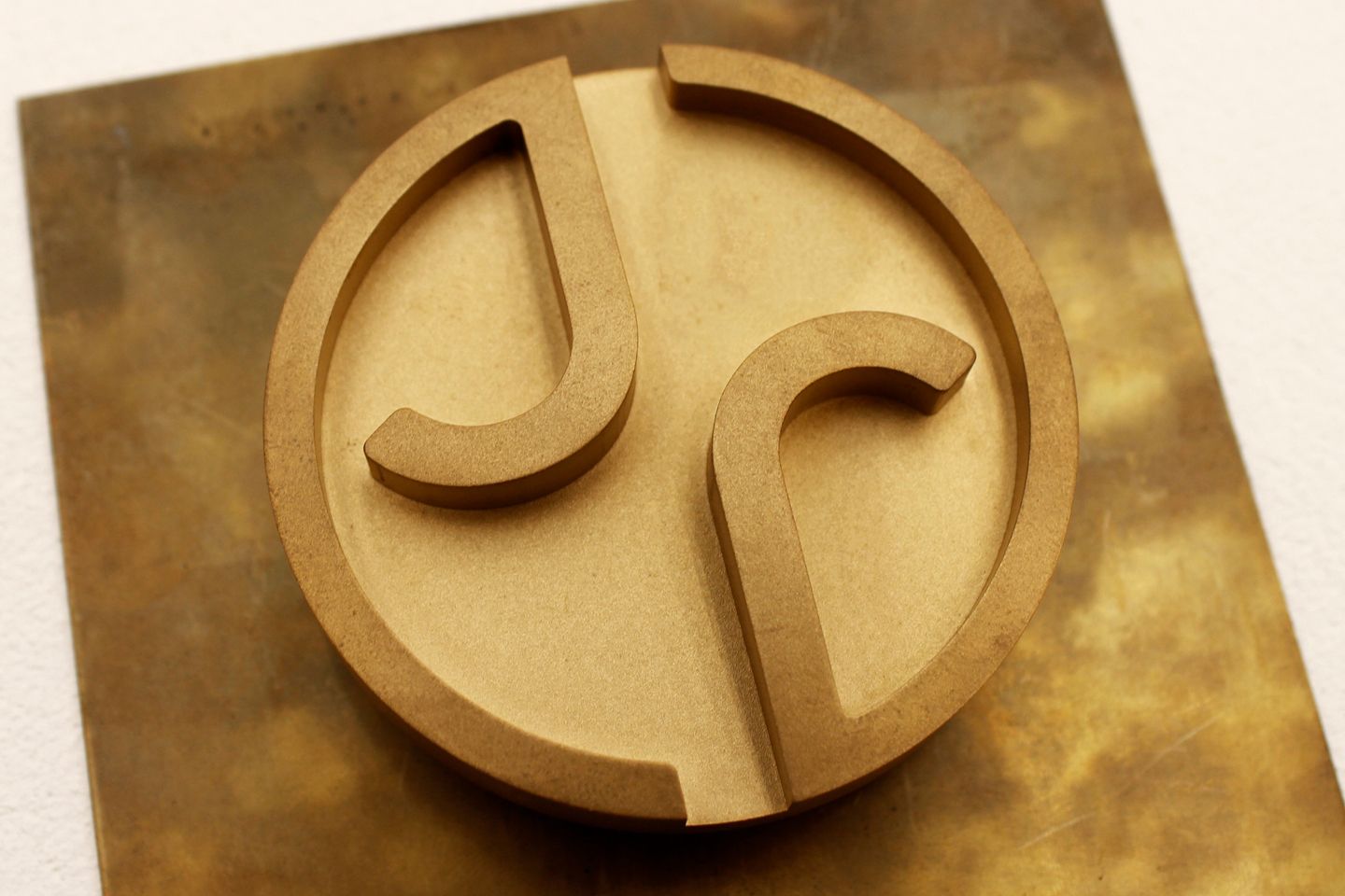
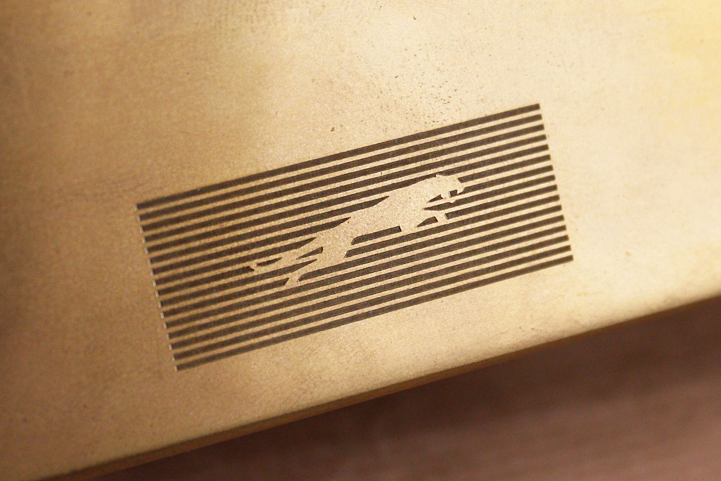
The so-called Monogram, a play on the lowercase letters J and R, is not meant as a standalone logo but will be applied as ‘a flourish or finishing touch’. So you can expect to find them in some out-of-the-way places, most likely at a smaller scale where Jaguar feels like it needs to sign something off. It is a companion piece to what the manufacturer calls its ‘Makers Marks’, the more important one being, of course, the ‘leaper’ - the apex predator bounding forward. Of all the signifiers, this is surely the one that most people consider synonymous with the brand, and while Jaguar says it has ‘reimagined’ it for a new era, it has been shrewd enough to not materially alter the basic shape.
It is pictured against those horizontal lines for good reason: this is what Jaguar terms the ‘Strikethrough’ and while for now it seems little more than a natty linear graphic made up of 16 positive stripes, this is considered a primary part of the ‘Copy Nothing’ visual code. Generally speaking, it is meant to symbolise ‘striking through imitation and the ordinary’, but it is also the sort of recognisable and adaptable design motif that can be easily reproduced in different settings and sizes. Expect to see it feature prominently.
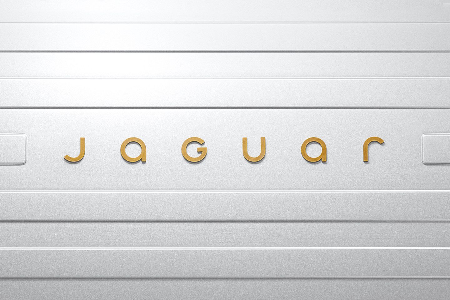
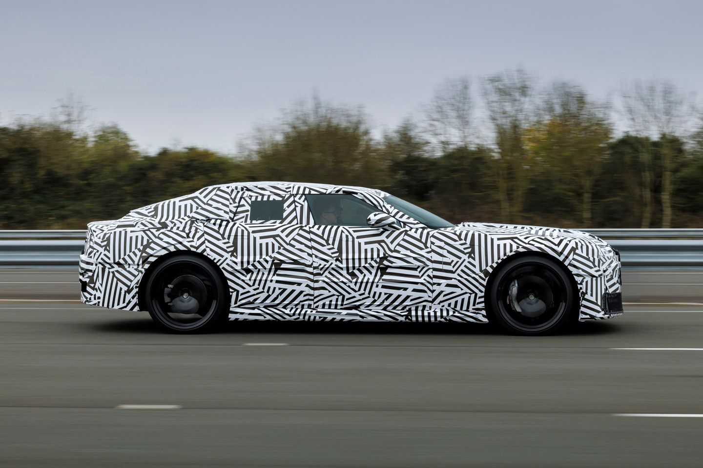
Finally, there is the Device Mark, which, as it spells out Jaguar’s name, is probably the one that will immediately resonate - or at least garner a response. It certainly did so in the flesh, with not every observer appreciating the blending of upper and lowercase characters, nor the relative simplicity of the geometric font. But Jaguar has loudly declared itself unafraid of polarising views, and without wishing to get off the fence at this very early phase, PH quite liked the result. Calling it ‘a powerful celebration of modernism’ is to reach unnecessarily for hyperbole - but, for now, pictures of a working prototype aside, all Jaguar has are big words. In a few short weeks, it must back them up.
Gassing Station | General Gassing | Top of Page | What's New | My Stuff


 te
te