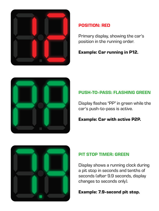
Stupid large numbers on the cars
Discussion


Worked for decades before.
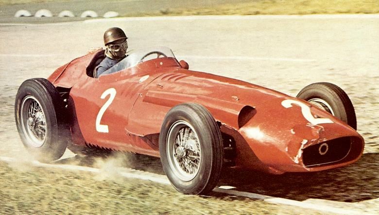
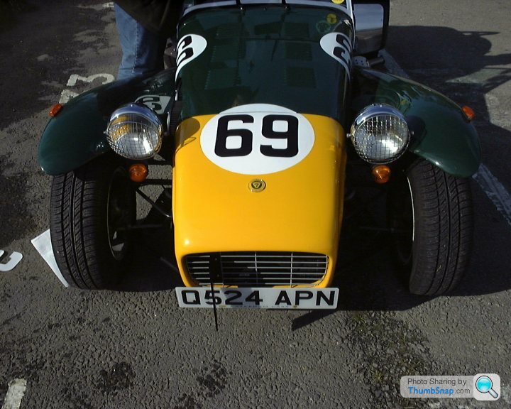
In the fifties
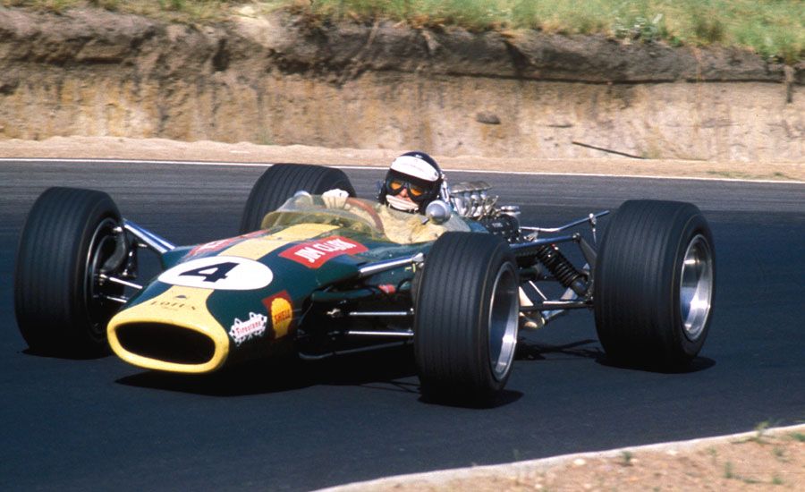
In the Sixties
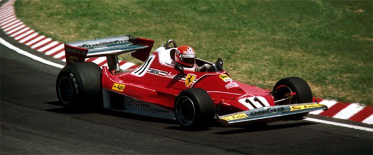
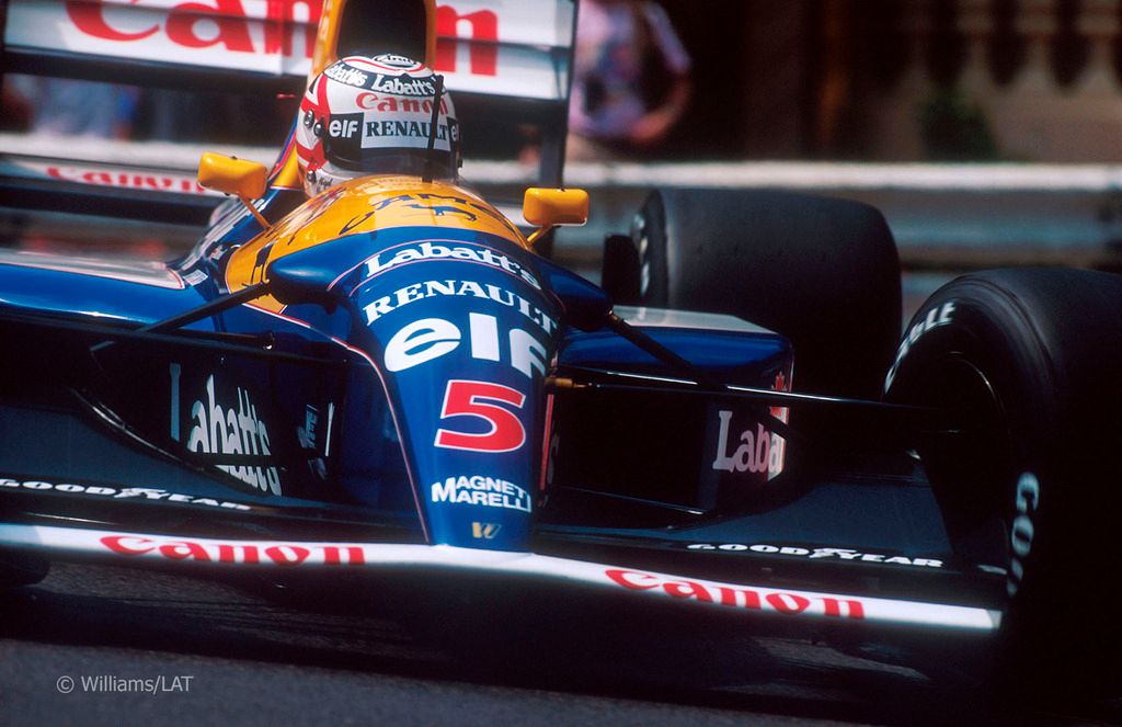
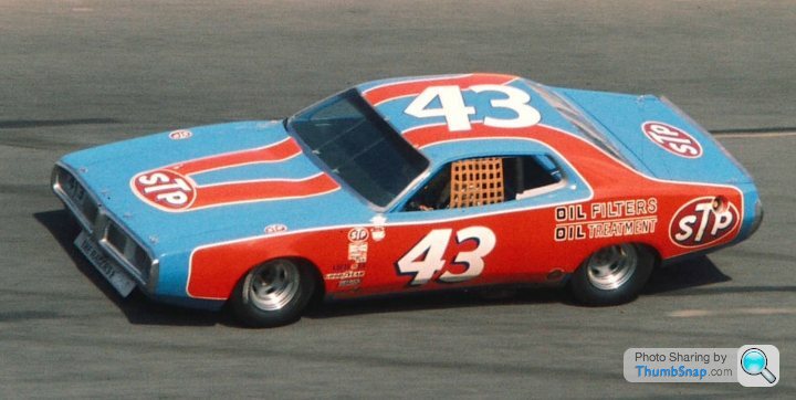
In the Seventies (look familiar?)
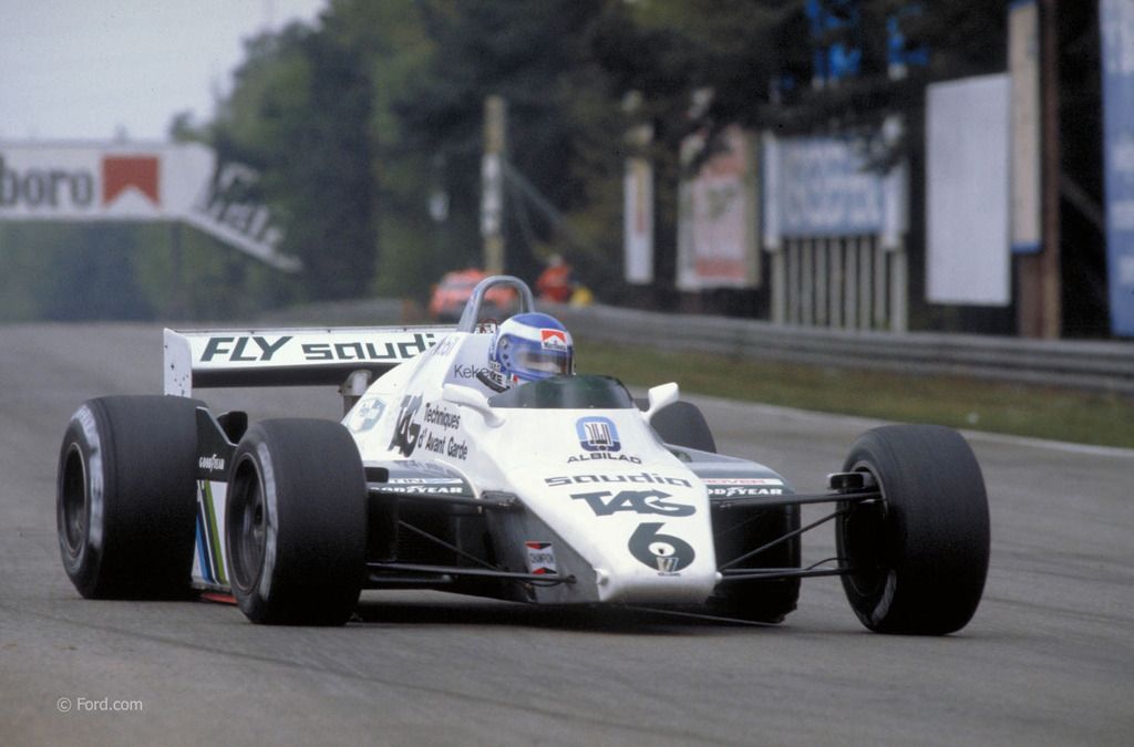
The Eighties
The Nineties
All stupid - nothing iconic there
I quite like it - its only in the last ten years or so that the numbers have become less conspicuous
In the fifties

In the Sixties

In the Seventies (look familiar?)

The Eighties

The Nineties

All stupid - nothing iconic there
I quite like it - its only in the last ten years or so that the numbers have become less conspicuous
Edited by Vocal Minority on Friday 12th May 22:52
Edited by Vocal Minority on Friday 12th May 22:52

MitchT said:
The three letters are helpful but they should be in the same location on every car. The position seems to vary between teams. The numbers are still hard to read. Just make them black on a white roundel FFS!
Yep - not sure where on the car to look for them. Would make far more sense for them to be on the nose and rear wing endplates on every car. Although they probably can't suddenly introduce that as some teams will have sold that as prime sponsorship space.

It's a great improvement when you are at a foreign race, commentary is in a foreign language, the cars go by quickly and e.g. the Red Bull cars are very difficult to distinguish. I go to a foreign race every year and when you are in the grandstands you don't have the same detail and information that the sofa viewers get. Now they need to make the positions and style consistent. I wonder why Bernie never did anything useful for spectators?

Gassing Station | Formula 1 | Top of Page | What's New | My Stuff