Discussion


loafer123 said:
Couldn’t work out which existing thread was most relevant, so decided to start a new one.
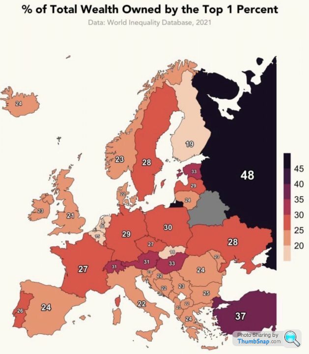
I was very surprised to see this data;
Are we a lot more “progressive” than the media would have us believe?
My gut instinct on that is that it is due to the Thatcher push to expand home ownership combined with house price growth since the mid nineties and doesn't show the direction of travel, which is the real area of concern. I was very surprised to see this data;
Are we a lot more “progressive” than the media would have us believe?
As someone who works with data, images like that make me shudder.
It's taking one dimension of one metric and representing it as a view of inequality.
It's utter misleading (or it could be - we don't know because there's no other data points to look at).
For example, is inequality only measured by 1% vs 99%? Why not in deciles? Would the numbers look very different if you showed that map by the top 0.1% or top 2%?
And is inequality based on country level? The image says 'World Inequality Database', so is their remit global inequality or national inequality. Because this is very much the latter and makes no inroads whatsoever in explaining the former.
Finally, the colour grading is very subjective and emotional. With the exception of Russia, and perhaps Turkey, almost all the other countries fit within a fairly narrow range of numbers, yet the shading difference is enormous.
End result, this is crap.
oyster said:
As someone who works with data, images like that make me shudder.
It's taking one dimension of one metric and representing it as a view of inequality.
It's utter misleading (or it could be - we don't know because there's no other data points to look at).
For example, is inequality only measured by 1% vs 99%? Why not in deciles? Would the numbers look very different if you showed that map by the top 0.1% or top 2%?
And is inequality based on country level? The image says 'World Inequality Database', so is their remit global inequality or national inequality. Because this is very much the latter and makes no inroads whatsoever in explaining the former.
Finally, the colour grading is very subjective and emotional. With the exception of Russia, and perhaps Turkey, almost all the other countries fit within a fairly narrow range of numbers, yet the shading difference is enormous.
End result, this is crap.
A perfect summary of why nothing can be read meaningfully into the map. (Aside from perhaps the extremes but even then context may change things)It's taking one dimension of one metric and representing it as a view of inequality.
It's utter misleading (or it could be - we don't know because there's no other data points to look at).
For example, is inequality only measured by 1% vs 99%? Why not in deciles? Would the numbers look very different if you showed that map by the top 0.1% or top 2%?
And is inequality based on country level? The image says 'World Inequality Database', so is their remit global inequality or national inequality. Because this is very much the latter and makes no inroads whatsoever in explaining the former.
Finally, the colour grading is very subjective and emotional. With the exception of Russia, and perhaps Turkey, almost all the other countries fit within a fairly narrow range of numbers, yet the shading difference is enormous.
End result, this is crap.
Dingu said:
oyster said:
As someone who works with data, images like that make me shudder.
It's taking one dimension of one metric and representing it as a view of inequality.
It's utter misleading (or it could be - we don't know because there's no other data points to look at).
For example, is inequality only measured by 1% vs 99%? Why not in deciles? Would the numbers look very different if you showed that map by the top 0.1% or top 2%?
And is inequality based on country level? The image says 'World Inequality Database', so is their remit global inequality or national inequality. Because this is very much the latter and makes no inroads whatsoever in explaining the former.
Finally, the colour grading is very subjective and emotional. With the exception of Russia, and perhaps Turkey, almost all the other countries fit within a fairly narrow range of numbers, yet the shading difference is enormous.
End result, this is crap.
A perfect summary of why nothing can be read meaningfully into the map. (Aside from perhaps the extremes but even then context may change things)It's taking one dimension of one metric and representing it as a view of inequality.
It's utter misleading (or it could be - we don't know because there's no other data points to look at).
For example, is inequality only measured by 1% vs 99%? Why not in deciles? Would the numbers look very different if you showed that map by the top 0.1% or top 2%?
And is inequality based on country level? The image says 'World Inequality Database', so is their remit global inequality or national inequality. Because this is very much the latter and makes no inroads whatsoever in explaining the former.
Finally, the colour grading is very subjective and emotional. With the exception of Russia, and perhaps Turkey, almost all the other countries fit within a fairly narrow range of numbers, yet the shading difference is enormous.
End result, this is crap.
The “top 1%” is meaningless. The top 1% is one in 100 people. That’s not some tiny elite, that’s people with £600k in wealth, which is a modest sized 4 bed detached in most of the county (and a 1 bed flat in some parts). What that doesn’t show is the wealth pooled by those who are actually wealthy, not simply middle aged professionals. The important question is how much of that is held not by the top 1% but by the to 0.001% or smaller. How many people are there for whom £600k isn’t the wealth of a life time of mortgage payments (and some measure of luck in property values) but is that considered a bad bonus this quarter or a good day for their investment portfolio.
This “top 1%” is not who we should look at, it’s a smoke screen those who truly are distorting the economy hide behind.
This “top 1%” is not who we should look at, it’s a smoke screen those who truly are distorting the economy hide behind.
Edited by Electro1980 on Friday 20th January 09:22
oyster said:
Is that relevant?
What if Paris has twice as many people with net wealth between say £800m and £1bn?
If somewhere has more millionaires and more billionaires than another place then you’d imagine there’s more wealth there?What if Paris has twice as many people with net wealth between say £800m and £1bn?
I didn’t add millionaires but 4x millionaires in London vs Paris and again the only European city in the top few. So map seems a little peculiar.
okgo said:
oyster said:
Is that relevant?
What if Paris has twice as many people with net wealth between say £800m and £1bn?
If somewhere has more millionaires and more billionaires than another place then you’d imagine there’s more wealth there?What if Paris has twice as many people with net wealth between say £800m and £1bn?
I didn’t add millionaires but 4x millionaires in London vs Paris and again the only European city in the top few. So map seems a little peculiar.

Electro1980 said:
The “top 1%” is meaningless. The top 1% is one in 100 people. That’s not some tiny elite, that’s people with £600k in wealth, which is a modest sized 4 bed detached in most of the county (and a 1 bed flat in some parts). What that doesn’t show is the wealth pooled by those who are actually wealthy, not simply middle aged professionals. The important question is how much of that is held not by the top 1% but by the to 0.001% or smaller. How many people are there for whom £600k isn’t the wealth of a life time of mortgage payments (and some measure of luck in property values) but is that considered a bad bonus this quarter or a good day for their investment portfolio.
This “top 1%” is not who we should look at, it’s a smoke screen those who truly are distorting the economy hide behind.
While I would agree the problem is more likely to be top 0.1% I think your figures are out. As far as I can see the cut off for top 1% by wealth would be £3.6m. This “top 1%” is not who we should look at, it’s a smoke screen those who truly are distorting the economy hide behind.

The full data, and lots of other measures, is here;
https://wid.world/data/
I hear what Oyster says about it being a useless map, but sometimes you need something thought provoking to have a debate.
For example, if you say "Top 10%" instead, we still come out low on wealth %age compared to, for example, France and Sweden. Surely that means we have a more equal society than what are generally regarded as more socially democratic countries?
oyster said:
okgo said:
London is the only city in Europe that features on the top 10 cities with the most billionaires, apparently 68, just in front of Moscow.
Is that relevant?What if Paris has twice as many people with net wealth between say £800m and £1bn?
loafer123 said:
The full data, and lots of other measures, is here;
https://wid.world/data/
I hear what Oyster says about it being a useless map, but sometimes you need something thought provoking to have a debate.
For example, if you say "Top 10%" instead, we still come out low on wealth %age compared to, for example, France and Sweden. Surely that means we have a more equal society than what are generally regarded as more socially democratic countries?
Not necessarily, depends where/how the rest of the wealth is then distributed. https://wid.world/data/
I hear what Oyster says about it being a useless map, but sometimes you need something thought provoking to have a debate.
For example, if you say "Top 10%" instead, we still come out low on wealth %age compared to, for example, France and Sweden. Surely that means we have a more equal society than what are generally regarded as more socially democratic countries?
Gassing Station | News, Politics & Economics | Top of Page | What's New | My Stuff