Coronavirus - Data Analysis Thread
Discussion


A number of people have suggested we should have a separate thread for analysis of the data around the pandemic. The idea being that this should be factual and free from arguments, conspiracy theories and mask wars.
I can't see it lasting, but I am willing to give it a go.
To kick us off. Two charts to put 2020 all cause deaths into perspective:
1. A heat map of ONS all cause deaths for 2010-2019, adjusted for ONS population estimates with 2019 as the benchmark. The 2020 is actual:
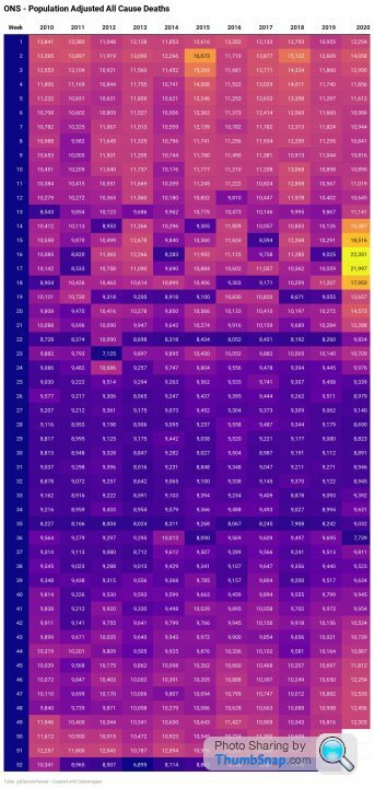
2. The same data presented as a graph
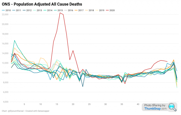
The Spring outbreak is clearly much more significant than the autumn one.
I can't see it lasting, but I am willing to give it a go.
To kick us off. Two charts to put 2020 all cause deaths into perspective:
1. A heat map of ONS all cause deaths for 2010-2019, adjusted for ONS population estimates with 2019 as the benchmark. The 2020 is actual:
2. The same data presented as a graph
The Spring outbreak is clearly much more significant than the autumn one.
Edited by Elysium on Sunday 20th December 14:53
Good call
eta:
Quoting Spruce Goose from the cure thread,
“ Heart disease, cancer, etc. Deaths are surprisingly down this year. Cv19 deaths are up, people that die at home are up.
The average age of cv19 deaths is 82, 1 year younger than normal average death age.
Hospitals are overwhelmed, but surprisingly no different to last 20 years.”
Having the above’s data, and indeed all relevant data, packaged and presented in an easily shared and understood format has to be done.
I’ll build a PowerPoint presentation based on what gets posted here.
Edited by steveT350C on Sunday 20th December 15:01
This graph divides all cause deaths into those 'due to' COVID and those where COVID is not noted as a cause of death.
Data is from ONS and population adjusted to the 2019 population. The dotted lines are the 5 year minimum, average and maximum and the green line is the point at which 2020 becomes 'statistically significant', which is 2 x standard deviations from the average:
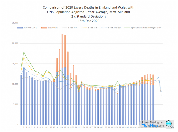
This shows statistically significant non-COVID excess deaths in the spring outbreak, but in the Autumn non-COVID deaths are below the 5 year minimum.
Data is from ONS and population adjusted to the 2019 population. The dotted lines are the 5 year minimum, average and maximum and the green line is the point at which 2020 becomes 'statistically significant', which is 2 x standard deviations from the average:
This shows statistically significant non-COVID excess deaths in the spring outbreak, but in the Autumn non-COVID deaths are below the 5 year minimum.
I also wanted to share this simple graph, which shows COVID deaths and Excess deaths (variance from the 5 year average) throughout 2020:
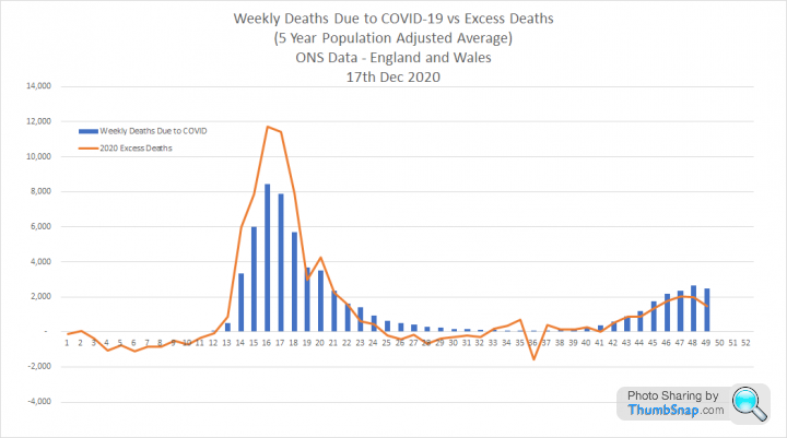
Spring excess deaths are approximately 5 times higher than Autumn, which I think provides some context for the relative scale of each 'wave'.
Spring excess deaths are approximately 5 times higher than Autumn, which I think provides some context for the relative scale of each 'wave'.
Edited by Elysium on Sunday 20th December 15:05
This graph shows the 7 day average of cases for London and Wales. I have identified the time periods where the Welsh Firebreak and English Lockdown could have had an impact on transmission.
Data here: https://coronavirus.data.gov.uk/details/cases
Both show a dip during tighter restrictions with a rapid rebound. London has rebounded harder, but was growing faster prior to restrictions. The dip at the end is reporting lag:

Data here: https://coronavirus.data.gov.uk/details/cases
Both show a dip during tighter restrictions with a rapid rebound. London has rebounded harder, but was growing faster prior to restrictions. The dip at the end is reporting lag:
Edited by Elysium on Sunday 20th December 15:28
steveT350C said:
Quoting Spruce Goose from the cure thread,
The average age of cv19 deaths is 82, 1 year younger than normal average death age.
I know we said ‘no arguments’, but the average Covid death age is 82.4; the average non-Covid death age is 81.5.The average age of cv19 deaths is 82, 1 year younger than normal average death age.
So average covid-death age is older, not younger.
Excellent idea Elysium. I too don't think it will last before it is hijacked, but let's at least have a go and keep it objective and dispassionate. Once emotions get into the mix then all bets are off because it doesn't matter what the data says then.
Let's look at this like scientists (as many of us actually are)
Let's look at this like scientists (as many of us actually are)
Elysium said:
This graph shows the 7 day average of cases for London and Wales. I have identified the time periods where the Welsh Firebreak and English Lockdown could have had an impact on transmission.
Data here: https://coronavirus.data.gov.uk/details/cases
Both show a dip during tighter restrictions with a rapid rebound. London has rebounded harder, but was growing faster prior to restrictions. The dip at the end is reporting lag:
Plenty of people travelled to London mid week for work from South Wales,Merthyr,Swansea during so called Welsh firebreak,two proved positive on hs2 job,hushed up Data here: https://coronavirus.data.gov.uk/details/cases
Both show a dip during tighter restrictions with a rapid rebound. London has rebounded harder, but was growing faster prior to restrictions. The dip at the end is reporting lag:
Edited by Elysium on Sunday 20th December 15:28
Elysium said:
This graph shows the 7 day average of cases for London and Wales. I have identified the time periods where the Welsh Firebreak and English Lockdown could have had an impact on transmission.
Data here: https://coronavirus.data.gov.uk/details/cases
Both show a dip during tighter restrictions with a rapid rebound. London has rebounded harder, but was growing faster prior to restrictions. The dip at the end is reporting lag:
Like I replied in the other thread. Looks like lockdown does have an effect. It is just short lived and doesn't effect the eventual outcome given what looks like a quick "reversion to the mean" once the restrictions stop.Data here: https://coronavirus.data.gov.uk/details/cases
Both show a dip during tighter restrictions with a rapid rebound. London has rebounded harder, but was growing faster prior to restrictions. The dip at the end is reporting lag:
Edited by Elysium on Sunday 20th December 15:28
So perhaps there is a use for them. But the expectations should be that it's not going to make the virus go away. It will come straight back again the moment you emerge. Obviously we cannot lockdown ad infinitum, but perhaps they can be used to buy some time for the services.
But then we are not seeing anything like as bad as it was in spring, so are they actually being genuinely useful?
This graph helps illustrate the potential hidden scale of the pandemic.
Cases, admissions and deaths from here: https://coronavirus.data.gov.uk/
The infection curve is calculated from daily deaths assuming a constant IFR of 0.6% and a time from infection to death of 21 days:

I believe this shows the vast scale of infections that was probable in the spring, but that we were completely unable to detect. And also that, despite massive increases in testing and case numbers we may still be missing a great many cases in the autumn.
Admissions and are deaths barely visible at this scale.
Cases, admissions and deaths from here: https://coronavirus.data.gov.uk/
The infection curve is calculated from daily deaths assuming a constant IFR of 0.6% and a time from infection to death of 21 days:
I believe this shows the vast scale of infections that was probable in the spring, but that we were completely unable to detect. And also that, despite massive increases in testing and case numbers we may still be missing a great many cases in the autumn.
Admissions and are deaths barely visible at this scale.
Edited by Elysium on Monday 21st December 23:09
Elysium said:
This graph helps illustrate the hidden scale of the pandemic.
Cases, admissions and deaths from here: https://coronavirus.data.gov.uk/
The infection curve is calculated from daily deaths assuming a constant IFR of 0.6% and a time from infection to death of 21 days:
This shows the vast scale of infections that was likely in the spring, but that we were completely unable to detect. It also shows that, despite massive increases in testing and case numbers we must still be missing a great many cases in the autumn.
Admissions and are deaths barely visible at this scale.
What’s the sum total of the area under the infections graph?Cases, admissions and deaths from here: https://coronavirus.data.gov.uk/
The infection curve is calculated from daily deaths assuming a constant IFR of 0.6% and a time from infection to death of 21 days:
This shows the vast scale of infections that was likely in the spring, but that we were completely unable to detect. It also shows that, despite massive increases in testing and case numbers we must still be missing a great many cases in the autumn.
Admissions and are deaths barely visible at this scale.
We know the sum under the cases graph is circa 2m.
Extrapolated out, that graph suggests herd immunity isn’t so far away.
oyster said:
Elysium said:
This graph helps illustrate the hidden scale of the pandemic.
Cases, admissions and deaths from here: https://coronavirus.data.gov.uk/
The infection curve is calculated from daily deaths assuming a constant IFR of 0.6% and a time from infection to death of 21 days:
This shows the vast scale of infections that was likely in the spring, but that we were completely unable to detect. It also shows that, despite massive increases in testing and case numbers we must still be missing a great many cases in the autumn.
Admissions and are deaths barely visible at this scale.
What’s the sum total of the area under the infections graph?Cases, admissions and deaths from here: https://coronavirus.data.gov.uk/
The infection curve is calculated from daily deaths assuming a constant IFR of 0.6% and a time from infection to death of 21 days:
This shows the vast scale of infections that was likely in the spring, but that we were completely unable to detect. It also shows that, despite massive increases in testing and case numbers we must still be missing a great many cases in the autumn.
Admissions and are deaths barely visible at this scale.
We know the sum under the cases graph is circa 2m.
Extrapolated out, that graph suggests herd immunity isn’t so far away.
So the area under the curve will be 67,401/.006 = 11.23 million, which is 19% of the 2019 England and Wales population.
Elysium said:
oyster said:
Elysium said:
This graph helps illustrate the hidden scale of the pandemic.
Cases, admissions and deaths from here: https://coronavirus.data.gov.uk/
The infection curve is calculated from daily deaths assuming a constant IFR of 0.6% and a time from infection to death of 21 days:
This shows the vast scale of infections that was likely in the spring, but that we were completely unable to detect. It also shows that, despite massive increases in testing and case numbers we must still be missing a great many cases in the autumn.
Admissions and are deaths barely visible at this scale.
What’s the sum total of the area under the infections graph?Cases, admissions and deaths from here: https://coronavirus.data.gov.uk/
The infection curve is calculated from daily deaths assuming a constant IFR of 0.6% and a time from infection to death of 21 days:
This shows the vast scale of infections that was likely in the spring, but that we were completely unable to detect. It also shows that, despite massive increases in testing and case numbers we must still be missing a great many cases in the autumn.
Admissions and are deaths barely visible at this scale.
We know the sum under the cases graph is circa 2m.
Extrapolated out, that graph suggests herd immunity isn’t so far away.
So the area under the curve will be 67,401/.006 = 11.23 million, which is 19% of the 2019 England and Wales population.
(CDC estimate of IFR 0.24, cant see there's being lower than ours, but who knows?
Some other interesting data sites:
1. A COVID 'tier' visualiser, which is now somewhat overtaken by events.
https://coviddatashare.s3-eu-west-1.amazonaws.com/...
2. This website lets you display a number of data sets by area:
https://victimofmaths.shinyapps.io/COVID_LA_Plots/
3. Swedens live numbers:
https://c19.se/
4. A great site to compare latest info by country:
https://datagraver.com/corona/#/
It's essential that all graphs posted can be recreated from source data by anyone with a basic level of spreadsheet knowledge, in order to build confidence in the data sets. Poorly presented graphs or graphs with no source data are not very useful and can discredit something that is otherwise genuine. We see this at every government presentation and throughout all industry.
Data manipulation is underhand and uncalled for, and in some case just dangerous. Let the data speak for itself.
Data manipulation is underhand and uncalled for, and in some case just dangerous. Let the data speak for itself.
I have no idea how to share the data set behind these graphs, but it is all taken directly from here:
https://coronavirus.data.gov.uk/
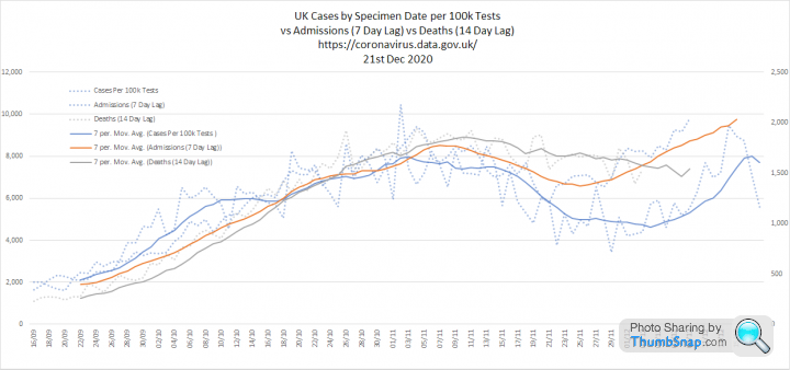
My cases per 100k graph compares positive cases by specimen date to tests processed two days later.
1. Tests and Cases. Although cases have been increasing, we have also been testing more, topping 440k tests processed in a day for the first time. This suggests to me that we have reversed the lockdown 'dip', so what happens next will be interesting:
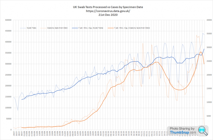
2. Cases per 100k tests, admissions and deaths. Cases and admissions now showing an uptick. Deaths will follow:
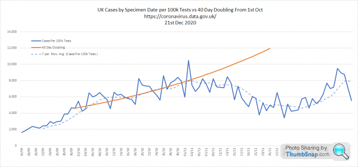
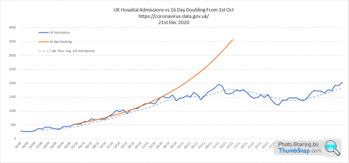
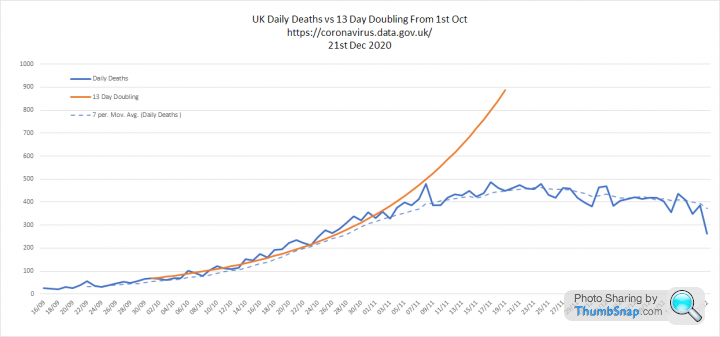
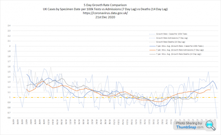
3. Overlay of the above and corresponding growth rates:
https://coronavirus.data.gov.uk/
My cases per 100k graph compares positive cases by specimen date to tests processed two days later.
1. Tests and Cases. Although cases have been increasing, we have also been testing more, topping 440k tests processed in a day for the first time. This suggests to me that we have reversed the lockdown 'dip', so what happens next will be interesting:
2. Cases per 100k tests, admissions and deaths. Cases and admissions now showing an uptick. Deaths will follow:
3. Overlay of the above and corresponding growth rates:
Gassing Station | News, Politics & Economics | Top of Page | What's New | My Stuff