Which looks the best, just aesthetics?
Poll: Which looks the best, just aesthetics?
Total Members Polled: 192
Discussion
I was browsing the classifieds yesterday just to see what prices are doing and started to think about how ugly and cobbled together the S1 Elise looks, then the S3 it's just horrid. The S2 Elise looks far better than either, but the S1 Exige also looks good. Side profile I think the VX220 looks best of all and the Europa better in a grown up way.
What are other peoples opinions, keeping voting purely on looks.
What are other peoples opinions, keeping voting purely on looks.
Edited by Herman Toothrot on Tuesday 1st February 08:35
For me, I think the order goes S1 Exige, S2 Elise, VX220, S2 Exige, S1 Elise. I'm not quite sure why the S1 Exige is first and the S1 Elise last. I haven't seen a Europa or face-lifted S2 close enough to really know where to place them.
ETA: Actually I've reordered the S2 Exige and VX220 after thinking about it a bit.
ETA: Actually I've reordered the S2 Exige and VX220 after thinking about it a bit.
Edited by kambites on Tuesday 1st February 09:37
The S1 Exige to me looks finished, the S1 Elise doesn't, it looks like a lot of after thoughts, none of the panels seem to fit together to form a whole.
Different bits of the cars look better in isolation. After junking the horrid standard vx wheels I think the side profile looks great, never been that fussed about the front straight on however.
Over all I think the S2 Elise looks best, purposeful, flows together well, i like it. S2 Exige looks a bit overweight and fussy at the rear some how.
S2 Elise
VX220
S1 Exige
Europa
S2 Exige
S1 Elise
Is how I'd pick on looks alone.
At 14 votes S1 Elise is the ugly duckling, S2 the swan. Looks like I'm not alone then.
Edited by Herman Toothrot on Tuesday 1st February 09:36
Slightly bias as I have an S2 Exige but for me S2 Exige, S1 Exige, S1 Elise, S2 Elise. I don't like the new front or rear on the S3 Elise so wouldn't even consider it.
VX220, can never make my mind up on. In the right colour it looks a fine beast but in the wrong colour is looks too angular. Just my 2p's worth.
VX220, can never make my mind up on. In the right colour it looks a fine beast but in the wrong colour is looks too angular. Just my 2p's worth.
400SE Dave said:
Slightly bias as I have an S2 Exige but for me S2 Exige, S1 Exige, S1 Elise, S2 Elise. I don't like the new front or rear on the S3 Elise so wouldn't even consider it.
VX220, can never make my mind up on. In the right colour it looks a fine beast but in the wrong colour is looks too angular. Just my 2p's worth.
Ugh. You reminded me about the S3, that thread the otherday about have Lotus stopped selling cars - after looking at a load of them in the classifieds I see why. Seem to have gone from copying Porsche successfully with the last S2's to copying Ferrari with the S3 and getting it very wrong.VX220, can never make my mind up on. In the right colour it looks a fine beast but in the wrong colour is looks too angular. Just my 2p's worth.
Based on looks alone;
1. S1 Exige (which is where my vote went)
2a. S1 Elise (not sure if the comment above was the right way round, surely the Exige is the one which looks more cobbled together as the rear clam overhangs the sills, the roof overhangs the windows, etc. However, I still make Exige my top choice)
2b. VX220 (last year I sold S1 Exige and got one of these. I think with the Turbo spec with the ears, lights, spoiler then it's pretty much level with the S1 Elise. There are details with both which could be improved. With their hardtops on then it's reversed, the VXT takes #2a spot)
3. S2 Exige (in a decent colour, NOT in metallic pale blue)
4. S2 Elise (although if it had hardtop then probably would it take #3 spot, looks a bit more cohesive without the hunchback)
5. Europa (although they look MUCH better in the flesh rather than in photos. That white one on PH Classifieds last year was pretty nice)

VX220

S2 Elise

S1 Elise

Late covered headlight S1 Exige
Europa S

Late S2 Exige (porsche style front)

S3 Elise
After I started trying to find pictures of the same angle, and similar colours I've probably choosen the worse angle as they all look the most similar from it. Flat side on or rear 1/4 probably shows the most differences.
S1 definately looks better with covered headlights and roof on. Roll bar cover looks really out of place when the roofs off.
The S2 could have been a classic but for a few details.
The front end is way too fussy. The little indicator lights (that frequently drop out) look crap and shouldn't have been included. The bug-like headlights are a bit too sharp. Round headlights with streamlined covers would have looked timeless. The front grill area and splitter have a bit too much going on. The S2.5 (or whatever we're calling it) at least tries to sort all this out.
At the rear those daft little plastic air vents in the corners (that the exige doesn't have) should never have been added. I also liked it better when the pipes came out on either side and higher up.
I Reckon you want your car designs to look solid and clean. Fussy little details and added tat are the ruination of many a car. Give it clean lines and it’ll only ever look good. As it gets older it won’t date in a bad way and will look all the more interesting for its age.
davidf4 said:
I Reckon you want your car designs to look solid and clean. Fussy little details and added tat are the ruination of many a car. Give it clean lines and it’ll only ever look good. As it gets older it won’t date in a bad way and will look all the more interesting for its age.
well said...it's almost the same as comparing the Baby Elan vs. the Plus2
S2's look over-designed, like somebody trying to justify their job as a designer.
The original Julian Thompson co-designed S1 was a gem and, with the S1 Exige, will no doubt become the 'classic' models.
The S2s are more of an acquired taste, although many, including myself, now actually prefer them. But the Elises do seem to look more purposeful with the hardtop and black or dark grey wheels.
The S2s are more of an acquired taste, although many, including myself, now actually prefer them. But the Elises do seem to look more purposeful with the hardtop and black or dark grey wheels.
Geneve said:
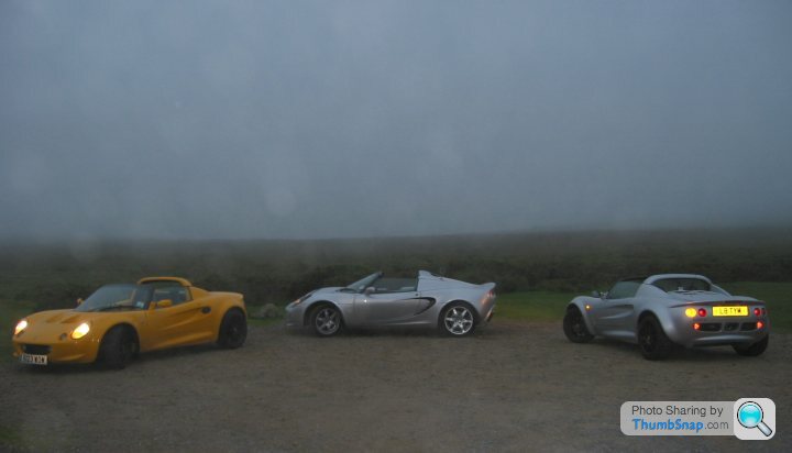
Picture above proves the point - Elises look better with black wheels
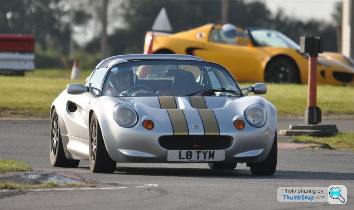
Both of the S1s in the picture are on 340R delivery wheels refinished in black (courtesy the South West Lotus Centre). Mine was still at the comedy ride height.Here she is post striping and much lower on Nitrons. I think this piccy really shows off the curves


Gassing Station | Elise/Exige/Europa/340R | Top of Page | What's New | My Stuff


