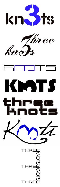
A couple of logo designs.
Author
Discussion

Blukoo

Original Poster:

3,812 posts

227 months

Wednesday 25th August 2010
quotequote all
They're for my mates band. I think the top two are my favourite.


andy_s

19,854 posts

289 months

Wednesday 25th August 2010
quotequote all
Skiffle or Rock and Roll?

Blukoo

Original Poster:

3,812 posts

227 months

Wednesday 25th August 2010
quotequote all
Neither. Is that what the logo suggests?

They're sort of indie/electro.

andy_s

19,854 posts

289 months

Wednesday 25th August 2010
quotequote all
Blukoo said:
Neither. Is that what the logo suggests?

They're sort of indie/electro.
No, I'm kidding. Top two as you show them, the others are a bit plain as is, and the 6th one down 'k3ot' could be mistaken for 'k3nt'...if you catch my drift.

Blukoo

Original Poster:

3,812 posts

227 months

Wednesday 25th August 2010
quotequote all
Would also just like to add this. Not so much a logo design, just an image to work with in the future.


Edited by Blukoo on Wednesday 25th August 12:23

Blukoo

Original Poster:

3,812 posts

227 months

Wednesday 25th August 2010
quotequote all
Last one one.


simonrockman

7,120 posts

285 months

Wednesday 25th August 2010
quotequote all
I really like the second one

GreigM

6,740 posts

279 months

Wednesday 25th August 2010
quotequote all
I don't like the top two - too fussy, difficult to read from a distance, not immediately recognisable.

I'd go for the 3rd last one - with the two words on separate lines - modern font which suits the style of music - easily readable/recognisable which is very important. I reckon you'd be changing the top two very quickly....